Friday, 12 October 2012

Phonica competitor research

I have looked at other independent record stores that also offer online shopping, I came across Rough Trade East which has been around nearly as long as Phonica and is also hugely successful. Sister Ray and Sounds of the Universe.
Rough Trade East has a similar feel to Phonica, they offer online shopping and host events instore, online shopping is more competetive than highstreet as location does not play a factor, customers could be swayed by packaging or the look of a website.

I can't find a website for Sister Ray so I don't think they will be an online competitor for Phonica but, they do take part in events such as record store day and are a hugely successful independent store.

Sounds of the universe also has a website and offers online shopping.
The websites for the stores are all well presented and the products are clearly visible making shopping easy, I want my packaging to help create a brand loyalty to Phonica, of all the stores I think that Phonica has a slightly more edgy feel, I aim to reflect this in my design.

Tuesday, 9 October 2012

Phonica Records Packaging

The brief is to design mail order packaging for Phonica Records that gives the customer a taste of the instore buying experience...

I started research for thiis brief by looking at Phonica records website and store, to help get a feel for the look and colours used I created some moodboards in my sketchbook, from these moodboards, a black, white and grey colour scheme emerged. The Phonica website is designed using greyscale, this helps the album artwork stand out from the screen when viewing the website.

This colour scheme inspired me to try out some patterns and designs using mixed media, I used charcoal, graphite, marker pens, fine liners, oil paints and ink to try out mark making, I wanted to create a hand rendered look as in my research of the store many of the signs and labels had been created by hand using marker pens.


Friday, 5 October 2012

Phonica Research

People shop at Phonica for a personal, unique shopping experience that can't be achieved in high street chains. Phonica website has a distinctive style and I feel that the packaging I develop should reflect this and recreate some sense of the in store experience. In order to inject the 'Phonica look' in to my packaging I have been looking at the logo and colour scheme of the Phonica website.The Phonica logo is catchy, I like the small lines and dots underneath the letters, I will try out some patterns and designs using these shapes. There is a distinctive grey scale theme with everything that is not actual record artwork on the website, this really makes the artwork stand out and creates continuity throughout. I plan to experiment with this colour scheme, I want the parcel that arrives to be instantly recognisable as a 'Phonica' parcel.
My next task is to look at the products I will be designing packaging for. Phonica offer a wide range of products for sale aside from music, the range includes:  

VINYL
RECORD SLEEVES
HEADPHONES
T-SHIRTS
SPEAKERS
MAGAZINES/BOOKS
RECORD BAGS
CD'S
POSTERS

The product range is extensive so I have decided to concentrate on just a couple of these products for my designs to create a feel for what the full range would look like.

Monday, 1 October 2012

Love Chloe re-brand

I am collaborating with Donna McTaggart for the rebrand task, we have decided to re-brand the 'Love Chloe' perfume bottle and packaging as we thought it looked a little tired and we wanted the challenge of bringing it up to date for a contemporary market.

After researching the brand I fohisund that Chloe is celebrating it's 60 year anniversary, with this in mind I was inspired to create some designs based on 1950's style, when the fashion house was founded, but with a contemporary twist...


Tuesday, 25 September 2012

Packaging


This project focusses on re-brand and package design.

In order to create a successful packaging re-brand I have conducted some research in to existing brand packaging design.
I looked at Benefit, well known for it's quirky 50's style designs. It is apparent that Benefit trades on it's distinctive, kitsch nostalgia and that the packaging has an emphasis on form. The idea of brands evoking a feeling is clear here and it is something I am keen to reflect in my design.
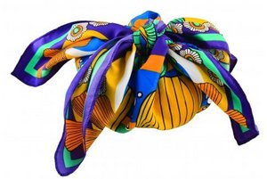
Lush was in complete contrast to benefit but equally exciting, Lush emphasise the fact that they are an ethical company, against animal testing and environmentally sound... of course this is reflected in their product packaging. Pots are recycled, plastic is minimal, and personalised stickers are added to show who made the product. There is a whole chalkboard type theme running throughout the products to create a continuity and recognition for the brand. I love the fact that although the packaging is minimal so as not to be wasteful, it is not boring! I particularly liked the innovative use of handmade scarves as a gift wrap...

Time Plan... October